# Logo Builder
# Description
Logo Builder was created to help web designers and web developers designing and creating astonishing logos in minutes, without leaving Wordpress ecosystem. From now on, you don't need to have expensive software installed to create a beautiful logos for your or your customer website. Simply install Logo BuilderBoy Wordpress plugin and create infinite number of logo without any hidden fees or restrictions.
If you don't want to buy a pig in a poke, download free version of Logo Builder here: download latest version (opens new window) and create your first logo for free.
Free version
Free version includes almost 5,000 built-in icons and 250 fonts to choose from.
Licensed version
Licensed version allows to search through almost 350,000 icons, add your own icon code and do everything that is in free version.
This documentation will help you understand what every property in Logo BuilderBoy plugin does. If you didn't find answer for your question, you can always reach out to us via contact form (opens new window).
# Use icon for your logo?
- Description: Component for enabling or disabling icon in created logo.
- Type: Boolean
- Values: True/False
- Default: True
- Visual description:
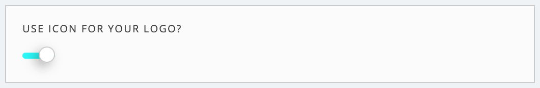
Fig #1 Use icon for your logo - component enabled
# Icon position
- Description: Component for choosing desired icon position for the logo.
- Type: Radio
- Values:
- left
- top
- Default: left
- Visual description:
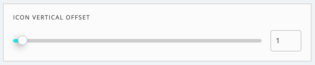
Fig #1 Icon position for logo - component
Fig #2 Icon position set to left
Fig #3 Icon position set to top
# Logo icon
- Description: Component for choosing desired icon for the logo.
- Type: Dropdown
- Values: Icon set as SVG
- Default: None
- Visual description:
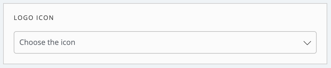
Fig #1 Icon for logo - component 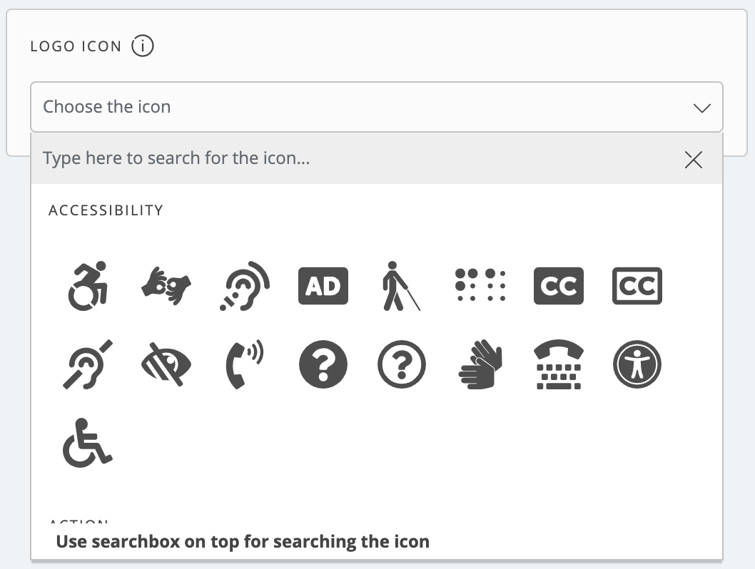
Fig #2 Icon for logo - expanded component 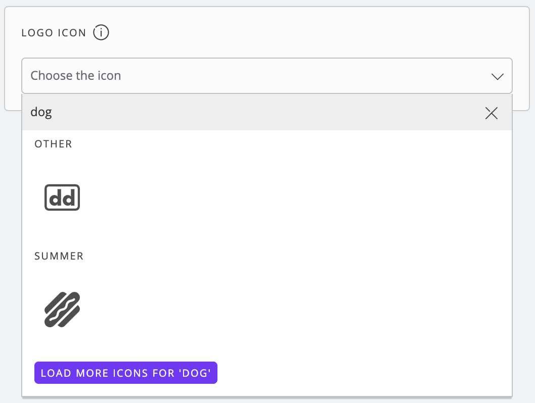
Fig #3 Icon for logo in licensed version & 'dog' search term - component
# Use your own icon svg code?
- Description: Component for enabling or disabling your own SVG icon in created logo.
- Type: Boolean
- Values: True/False
- Default: False
- Available in lincensed version only: Yes
- Visual description:
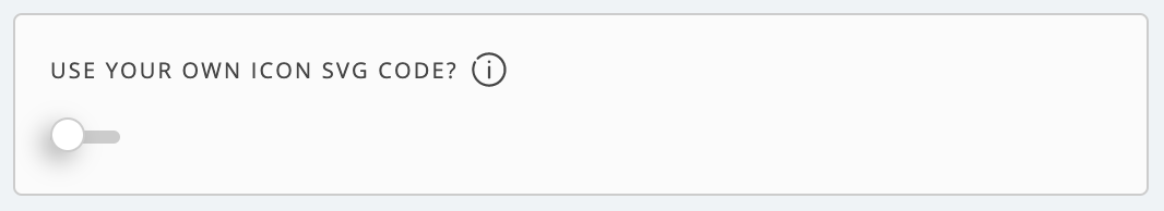
Fig #1 Use your own SVG icon - component 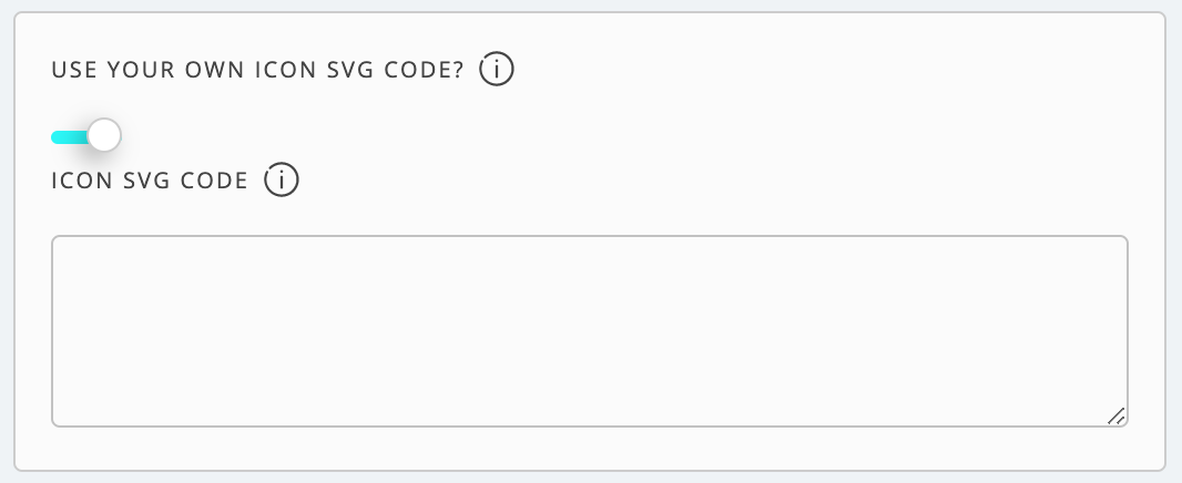
Fig #2 Use your own SVG icon - expanded component
# Icon SVG code
- Description: Component for pasting your own icon SVG code for the logo.
- Type: TextArea
- Values: SVG code
- Default: None
- Visual description:
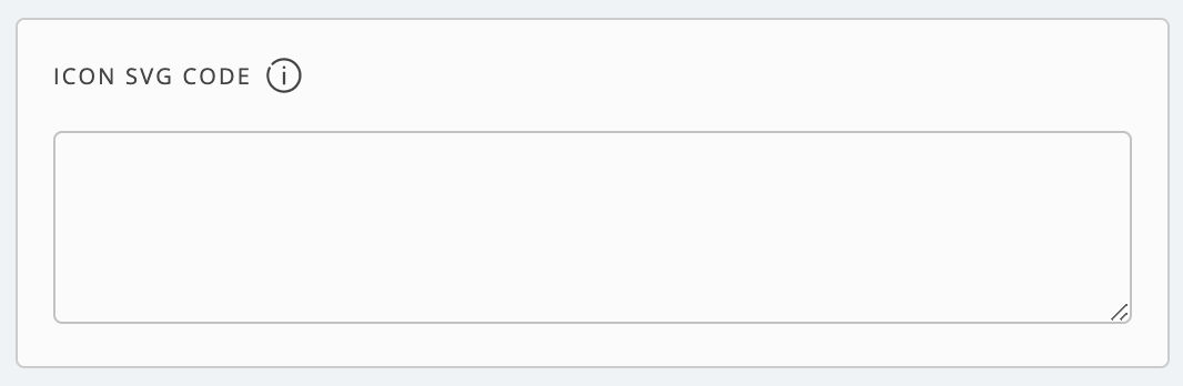
Fig #1 Icon SVG code - component
# Icon size
- Description: Component for setting icon size in the logo.
- Type: Range slider
- Values:
- Min: 2
- Max: 80
- Default: 30
- Visual description:
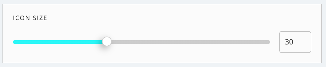
Fig #1 Icon size for logo - component
# Icon vertical offset
- Description: Component for setting icon vertical offset (up and down position) in the logo.
- Type: Range slider
- Values:
- Min: 0
- Max: 50
- Default: 1
- Visual description:
Fig #1 Icon vertical offset for logo - component
Fig #2 Vertical offset set to minimum value
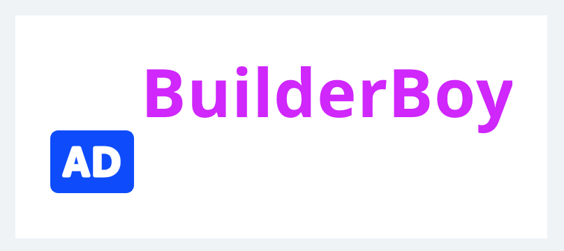
Fig #3 Vertical offset set to maximum value
# Horizontal offset
- Description: Component for setting icon horizontal offset (space size between icon and text) in the logo.
- Type: Range slider
- Values:
- Min: -50
- Max: 50
- Default: 0
- Visual description:
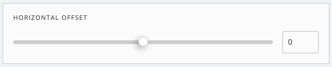
Fig #1 Icon horizontal offset for logo - component
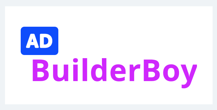
Fig #2 Horizontal offset set to minimum value
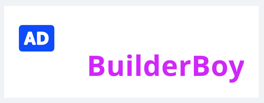
Fig #3 Horizontal offset set to maximum value
# Icon color
- Description: Component for setting icon color in the logo.
- Type: Color picker
- Values:
- Hex
- RGBA
- Default: #0043FF
- Visual description:
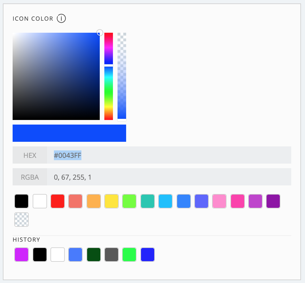
Fig #1 Icon color for logo - component
# Logo text
- Description: Component for setting text in the logo.
- Type: Input text
- Values: String
- Default: BuilderBoy
- Visual description:
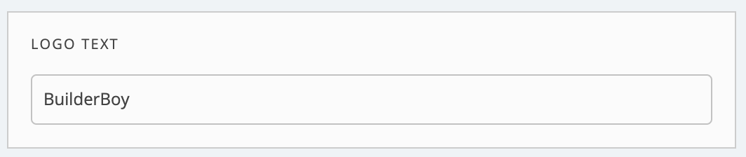
Fig #1 Text for logo - component
# Font family
- Description: Component for setting text's font family in the logo. Every font in Google Fonts Directory has it own list of available styles. For a complete list of available font weights, please check Google Fonts website (opens new window).
- Type: Dropdown
- Values: Set of available font families
- Default: Noto Sans
- Visual description:
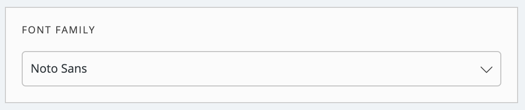
Fig #1 Font family for logo - component
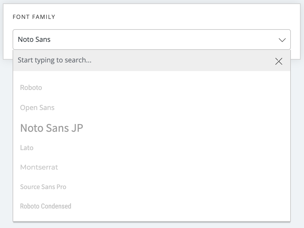
Fig #2 Font family for logo - expanded component
# Font weight
- Description: Component for setting text's font weight in the logo. Depending on chosen font family, this property will contain different items.
- Type: Dropdown
- Values: Set of available font weights for chose font family
- Default: 700
- Visual description:
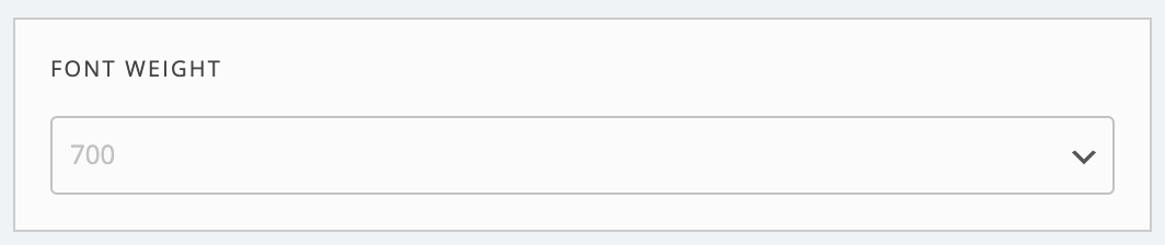
Fig #1 Font weight for logo - component
# Font size
- Description: Component for setting text's font size in the logo.
- Type: Range slider
- Values:
- Min: 10
- Max: 80
- Default: 25
- Visual description:
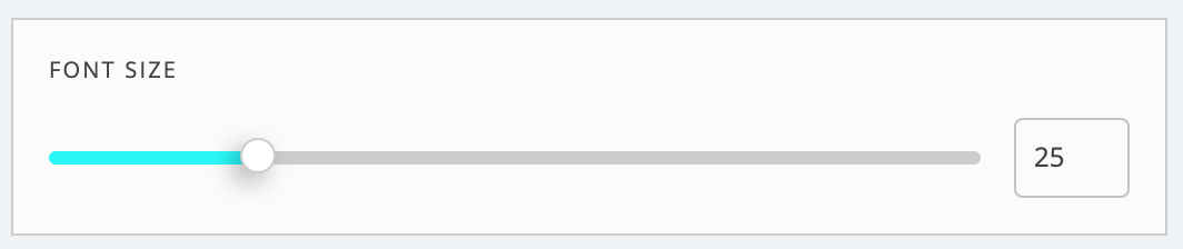
Fig #1 Font size for logo - component
# Letter spacing
- Description: Component for setting text's font letter spacing (space between each character) in the logo.
- Type: Range slider
- Values:
- Min: 0
- Max: 10
- Default: 1
- Visual description:
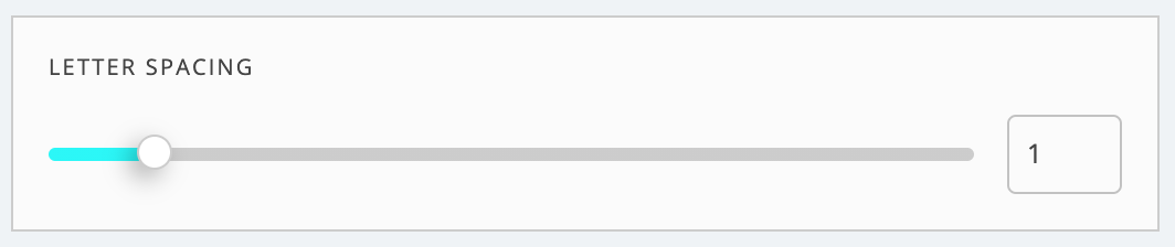
Fig #1 Letter spacing for logo - component
# Text vertical offset
- Description: Component for setting text vertical offset (up and down position) in the logo.
- Type: Range slider
- Values:
- Min: 0
- Max: 50
- Default: 0
- Visual description:
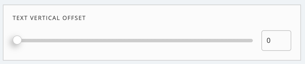
Fig #1 Text vertical offset for logo - component
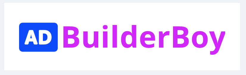
Fig #2 Vertical offset set to minimum value
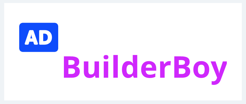
Fig #3 Vertical offset set to maximum value
# Font color
- Description: Component for setting text color in the logo.
- Type: Color picker
- Values:
- Hex
- RGBA
- Default: #D100FF
- Visual description:
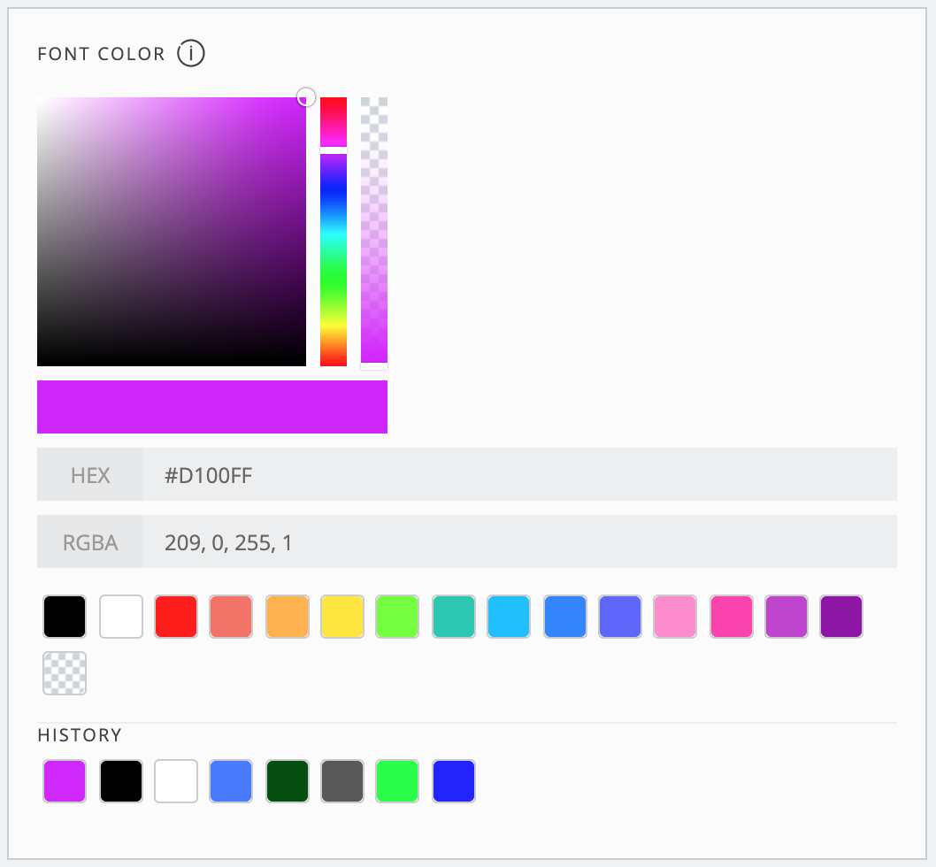
Fig #1 Text color for logo - component
# Generating logo files
- Description: Component for saving the logo.
- Type: Custom component
- Values:
- PNG logo download
- SVG logo download
- URL to PNG logo copy to clipboard
- Default: After clicking 'Save to media library' button logo is stored in your local Wordpress Media Library
- Visual description:
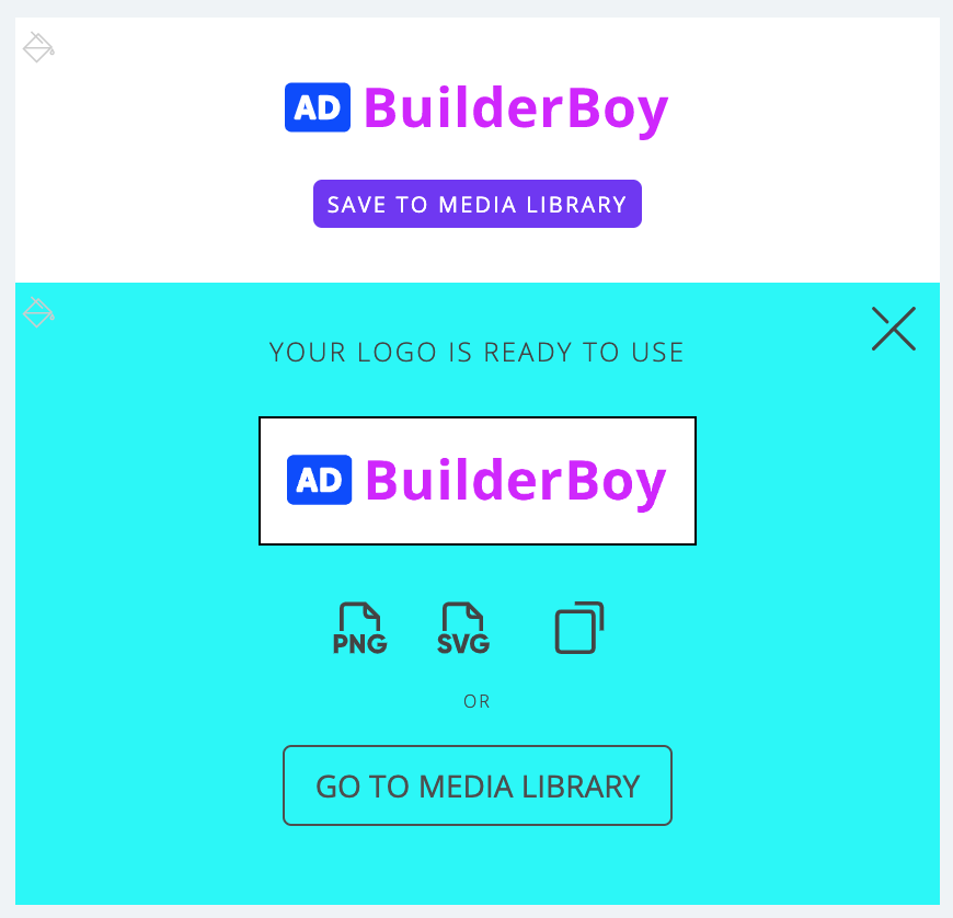
Fig #1 Generating logo files - component
# Advanced settings page
- Description:
Dedicated page, which allows you to manipulate every component's configuration using either HTML form fields or all-in-one JSON key value.
Did you find perfect logo on our site? Advanced settings page is the place where you can paste logo configuration provided in JSON format and customize it if you wish. Licensed version only - Type: Custom page
- Values:
- HTML form fields
- JSON key value
- Default: Default logo values
- Visual description:
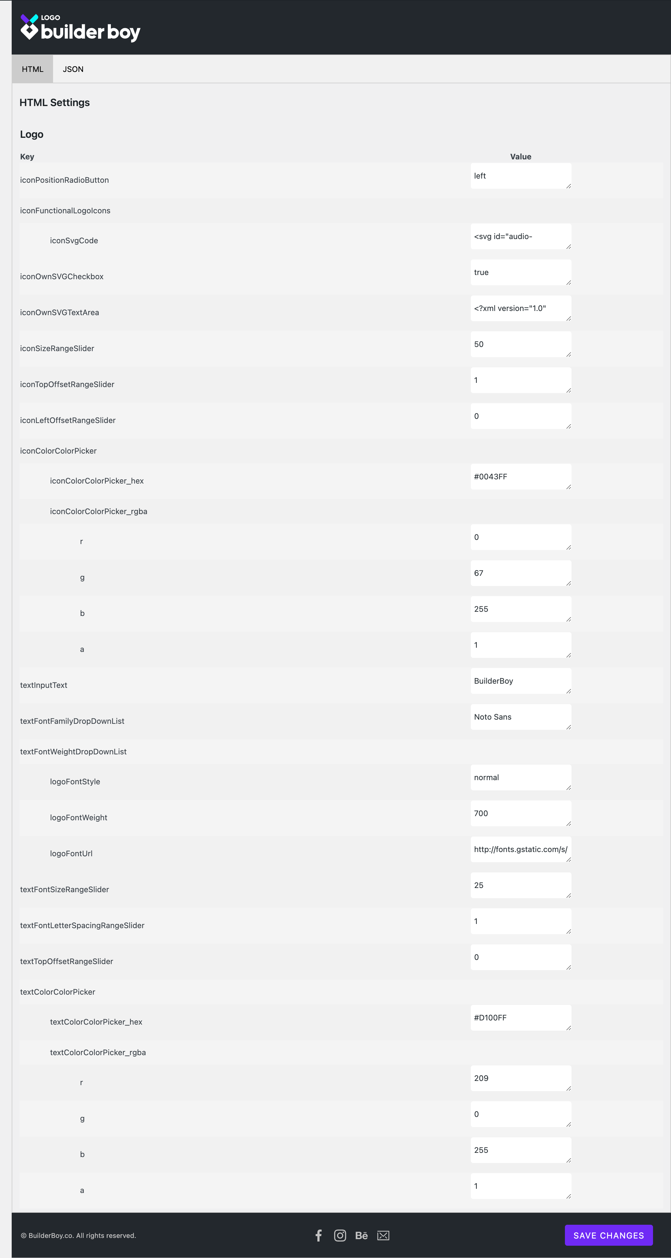
Fig #1 Advanced settings page - HTML form fields
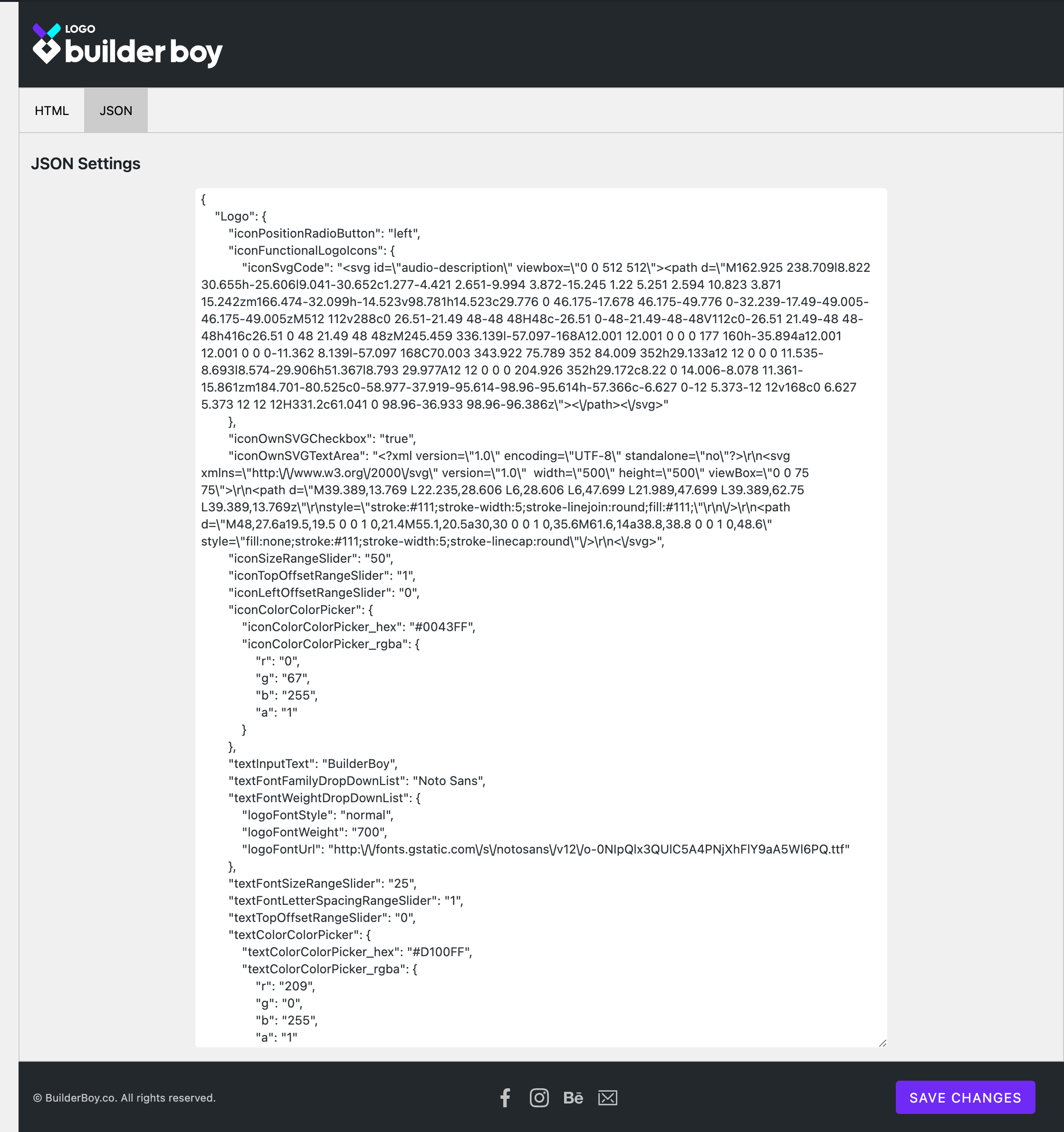
Fig #2 Advanced settings page - JSON key value